Wednesday, December 4, 2013

Sporegorger Thallid's baby pictures and ageing - Process

I wanted to share some process shots of this piece for anyone who's into that sort of thing. At each step I'll go into what major changes I made as well as why I decided to do so.
Initial Sketch
1. I started with a rough sketch of what I want my composition to look like and the overall shape of my creature. The idea behind the piece was to show a fungal creature that was spreading it's spores on other fungus, much like the idea behind Sporesower Thallid.

Color study
 2. I then set the initial sketch layer options to Multiply, and create another layer underneath where I start to figure out my color scheme. I knew I wanted the creature to have a reddish tone to it so in order to make it pop I decided to make the background green. I also had the idea to make it look like the spores were revitalizing the fungus, so I made sure to make the main fungus red while keeping all of the other fungus green to blend into the background. I also knew from the start I wanted to have a nice purple tone to the spore cloud.

Painting
 3.  Here's where I dive in and really start getting to the meat of the painting. I wasn't entirely pleased with the head shape of the creature so I made it a bit more pointed. I also start emphasizing my lighting setup here with the highlights around the shoulder area. Added a vine overlapping the tail to add some depth. Added some patches of dirt to the ground to break up all the green.

 4. I add a mouth to the creature in order to give it some dimension. I felt like before it was looking directly off into the left, but with a mouth it looks like the head is in profile-view. I thought it would be interesting to show the underside to the red mushroom. I also start hinting more at the shadow on the creature's rear. Got the idea to cover the background trees in fungus as well.

5. Decided that based on my lighting setup, the far-side of the creature's back probably wouldnt be getting hit with as much light so I put it in shadow. I added some color variation in the green tendril areas of the creature and defined their shape. Started working on the spore cloud.

 6. Lots of background work, added more fungus to trees, added some grass to the foreground fungus silhouettes, added some tail spikes (ideally made of fungus) to the creatures tail based on a stegosaurus. Added some more color variation to the spore cloud using different layer options (Color, Overlay, etc.). Added mushrooms to the foreground to make the creature look surrounded by them.

 7. Start painting in the spores one by one. I wanted to give a bright glow to the spores in order to emphasize the idea that they are beneficial to other fungus. I was thinking of Donato's Mechanic painting from his Massive Black tutorial video, and trying to apply my spores in the same way he did with the bright stars in his star-field. Even more color build-up on the spore cloud.

 8. More spores! Spores everywhere, adding more glow to some, letting others remain in the background. I also started thinking that the creature looked a little bland, so I added some more fungal elements to his body. Added a glow effect to the hood of the red mushroom to even further emphasizing that spores=good.

 9. Adding more details and texture, adding some more foreground grass refining some shapes/silhouettes.
 10. The only change between steps 9 and 10 are 2 adjustment layers, Curves and Levels. This really helps up the contrast in the image and gives it a lot more presence. You have to be careful not to overdo it with the adjustment layers though, which is why I adjust the opacity of each adjustment layer to my liking. This is about where I first called the painting "finished".

 11. After posting the image up on Facebook and getting feedback from some of my artist friends like Stephen Najarian and Dennis Darmody, I made the greens in the background more deep to help make the bright creature pop, saturated the green parts of the creature, and added a blue hue to the creature's rear side so there's a nice transition from warm into cool / highlight into shadow. This step really made the mood much more dramatic and made the image pop a lot more. I also went in a added some more transparent areas to the spore cloud so it didn't read as a solid object.

Final Finished Painting
12. Added some final details/rendering, most notably added texture to the creature's body and some mucus going across the opening on the back.

I hope you've enjoyed this process post, thanks for reading!

Monday, December 2, 2013

Sporegorger Thallid - My REAL Inspiration Challenge Entry

I was originally going to submit THIS piece for the Art Order Inspiration Challenge, but I missed a very important detail in the rules for the challenge so I couldn't submit it. The image has to be 100% your copyright, and since I was painting a monster right out of Final Fantasy IX, it didn't qualify. I was pretty bummed about it because I was pretty happy with the piece, and also because there wasn't much time left to do another piece, and I was really busy at the time. The deadline had passed and I was really upset because I missed out on a huge challenge that had a window of around 4 months to do something for. Then miraculously (for me at least) the deadline of the competition was extended another week due to Jon's cross-country move and suddenly I had another chance to get in on the action. It was pretty daunting, from conception to finish I had to create a brand-new painting from scratch, and I only had a few days to get it done. After considering a few options I remembered the piece I did for the Nymph Art Order Challenge which I did THIS piece for. I had originally meant to give the nymph a fungal companion in a full-scene painting, but I wasn't liking what I came up with and wound up scratching the idea for a full-scene and just painted a standalone figure. I had done sketches of the companion creature before, but I hadn't quite nailed down the design of it yet so I decided to explore that creature some more for the Inspiration Challenge. Below is the painting I came up with...

Sporegorger Thallid - Art Order Inspiration Challenge
This piece came together more quickly than any other painting I've ever done. I don't know if it was my fear or missing the deadline a second time, or my excitement for getting another chance, but I knocked out a sketch I was really happy with and proceeded to keep right on painting. Over the course of 2 days I completed this painting, while spending a 3rd day on revising it based on feedback. I managed to submit the piece a mere 4 hours before the submissions page closed. It's probably one of the strongest paintings I've ever made based on some of the reactions I've been getting to it, and I'm really happy with how it turned out as well. This was a huge landmark piece for me even without it being for a contest. Below you can see the paragraph write-up I made for the piece as part of the challenge requirements, as well as a pic of some of the pieces I got my inspiration from...

Cards that have spent time in my fungus deck - my Inspiration

I’ve become a big fan of the card game Magic: the Gathering and I still have the first deck I ever owned; a fungus deck that I bought off the shelf that I’m always tweaking. It’s an item that has become very close to me. I’ve fallen in love with how the deck works and I’ve spent hours staring at these cards and their awesome art and I’ve always wanted to design my own fungus creature and design a Magic card around that creature. Drawing inspiration from those fungus cards in the deck, I’ve created my Art Order entry.

What the illustration would look like applied to a Magic card

Wednesday, November 6, 2013

Learning from Crits, Part 2: Painting with new information.

A couple days ago I posted my Art Order "Inspiration Challenge" entry. I'm really happy with how the piece turned out, and a lot of that has to do with some of the decision making I dealt with while creating the piece. The crits from Illuxcon offered me some great insight of angles I wasn't considering when making a painting. In this post I'm going to use my latest piece as an example of some ideas I tried to incorporate based on the feedback I received on my portfolio. Here's the piece again as a refresher...
Antlion - Finished Painting
One of the things that Robh Ruppel talked about during my review with him was that I should be organizing me values in order to best serve the focus of my painting. I've stripped out the color of this piece to make it easier to see the values, and I've added some notes to the painting. The main thing to note with this image is that I made the areas of focus have the highest contrast (look at and around the face and mouth). Now compare the face of the creature to the values of the trees in the background, and the objects in the foreground...you'll notice that there's a much more narrow value range in these areas, they almost blend into the other non-focus elements. This was a conscious decision I made to ensure that the viewer would keep their attention right where I want it...the face.
Greyscale image with notes
Now let's take this one step further by using a threshold layer to turn the image into 2 values, pure black and white. In this image you can see that composition for this image is really just a dark object on a light background. The creature is the focus, thus I want him to pop out from the background.
B&W Threshold layer
In the next image I want to point out all the elements that help move the eye around the painting. All of the arrows indicate different elements that direct the viewer's eye around the image. Almost all the elements in the piece are helping direct the eye around and back towards the focus of the piece (the creature).
Lastly, I wanted to talk about the importance of color arrangement. In this next image you can see I've stripped out all the values of the piece leaving just the colors. You can see the creature's shape still holds up, based solely on color you can still tell what the focus is. I pretty much placed a colorful monster on a blue backdrop, so anything that isn't blue is the creature, thus it stands out from the background and pops more. You can also see that in the appendages and body fur, the colors are more muted than they are in the face, saturation control does a great job of helping enforce the focal point of your image as well.
I'm no expert, and I know a lot of this might sound long winded and repetitive in some places, but I thought it would be fun to share some of what I've been thinking about in my work lately and maybe you can start thinking about it in your own work, or use this as a refresher if you already know all about this stuff. Either way, writing this all up helped drill the ideas into my head even further so I'm excited to bring these lessons with me into my next piece.

Monday, November 4, 2013

Antlion

I've been itching to submit something for the latest ArtOrder Challenge for a while now*. Being that the theme of this challenge is "inspiration" it seemed like it offered a great opportunity for me to crank out some fan art. I spent a lot of time considering what I wanted to paint for this, and after a while I realized that I had never done any Final Fantasy IX art, FFIX being one of my all time favorite games. This also gave me the perfect chance to do a nice monster-illustration for Jon Schindehette (something he requested I do for him during my review with him at Illuxcon). So I thought, why not kill two birds with one painting and have some fun while I'm at it.

My Antlion

After sifting through all of the monsters in FFIX I picked one of my favorites, the Antlion. This creature is a common enemy in the game, but the way it is first introduced really made an impact on me when I first played the game years and years ago. When you climb to the top of this massive, hollowed out tree in the desert, you'll reach a settlement in the sky called Cleyra. There is a fork in the road, one path leads up into the town, and the other leads to an ominous sandy pit with not much else around...hmm interesting. Later a significant character is attached by the pit's inhabitant, the Antlion.

In-game graphics fighting the Antlion - FFIX

I love the design to this guy as well as his colors and I thought the setting would be fun to paint him in as well (I'm trying to steer away from monsters just chilling on a plain white background), so I decided to give him a go and I'm really happy with the results! I'm excited to enter the latest challenge and I'm hoping to have some more time to come up with another piece before the due date.

Not a real Magic card, created for promotional purposes only

Oh yeah, I also decided to make a Magic: the Gathering Antlion card using my illustration, I hope you get a kick out of it. I'm going to make another post on how I painted this piece using what I've learned from my recent critiques so stay tuned for that!

*Note: After reading over the competition guidelines again I realized that my entry is unacceptable due the creature being owned by SquareEnix. Oops.

Friday, November 1, 2013

A Very CollegeHumor Halloween

A few weeks ago I was approached by the kind fellows over at CollegeHumor regarding a new Halloweeny web article that they needed some illustrations for. The pitch? Spoofs on a classic book series called Scary Stories to Tell in the Dark, by Alvin Schwartz. If you're a long time reader of my blog you might remember a while back I wrote this Inspiration Spotlight article on Scary Stories. And with this project I was allowed to try my hand at spoofing some of the classic Stephen Gammell illustrations that I love so much!
Source material

The article was written up by CollegeHumor writer Michael Trapp, and art direction was provided by Caldwell Tanner. You can see the article and the illustrations in their final published form on the CollegeHumor website!

Fun extra, exclusive to my blog, below are the images as I sent them off to CollegeHumor...


It was a huge blast getting to emulate an artist I've admired for so long, and it's always a joy getting to work with the CollegeHumor team. They offer a nice break from the usual grind of fantasy illustration work. It's not often I get to flex my humor muscles so I like to enjoy it when I can. Not to mention the CollegeHumor guys are extremely pleasant to work with. Hope you had a Happy Halloween!

Friday, October 18, 2013

Learning from Crits

At Illuxcon I received a lot of really helpful advice on my portfolio, and since getting back I've been working on fixing up some of the problems people pointed out in my work as well as trying to polish them up and make them nice and sparkly. In this post I'll be sharing some of the feedback I recieved on some of my work as well as before-and-after shots. Hopefully some of you can get something out of the seeing the upgrades to my own work.

First up is my Owlbear piece. This piece has gone through revisions before. During my first pass at revising this piece I mainly focused on adding some more detail and finesse, but during my portfolio review with Robh Ruppel I learned a few new things I could do to make the piece really pop more. Mainly adding more muscle definition in the extended arm to really give a feel of action and ferocity.
Before crits

After crits

Notes
Next up, my Feiya piece, done as a promotional piece for Paizo. Again, I've reworked this one before too, just pushing the detail and refining some things. Some people suggested I push the slime a bit and make it more detailed.
Before crits

After crits

Notes
Next up is my Dream Devouring Demon. The dream-catcher webbing had a lazy execution first time around so I went in and really looked at a good dream-catcher for reference. After fixing it I was immediately much more satisfied with the result. It's amazing how something that seems so unimportant at first makes such a huge difference when done right. I was also told by many people that I need to focus on varying up my colors more and adding hue shifts throughout a material. It shouldn't always be "this is this color, this is that color" everything should have some other colors poking through here and there to add interest and realism to what you're painting.
Before crits

After crits
Notes

Up next, is the Man form of my Beastmaster. I got a lot of really helpful notes on this piece, but not all of the problems were fixed in the end. Sometimes it's better to take the lessons you've learned from an old piece and just apply that information towards your future work. From crits on this piece, I learned a lot about how you should arrange your values in a piece. Your focus should have the most contrast (darkest darks and lightest lights) but in this piece the bushes are really fighting with the figure for attention due to how dark they are. I worked on adjusting the values of the bushes and I even did some reshaping to them so they weren't creeping up on the figure so much, but in the end I was only able to do so much without completely repainting those areas. I definitely learned a lot from this piece due to the failures within.
Before crits
After crits

Notes


Lastly, the piece that headed my portfolio and received the greatest response from people I showed my portfolio to, my Beast-form Beastmaster. A lot of the feedback I received for the man-form Beastmaster piece applies to this as well, but I was able to fix a lot of those problems a little better with this piece. First of all, I had a lot of tree braches just poking into the image, somewhat awkwardly and it took away some of the impact of the composition and took attention away from the focus, so I just took them out and everything immediately started to feel better. I also tried to lighten up the foreground so it wasn't competing with the figure for attention so much. Chris Rahn was a huge help on this piece too. You can see in a lot of his work he really punches up the saturation and color in the shadows of his work and it creates a big impact on the viewer. This is something I hope to bring into all of my future work, so I'm excited to do some more original pieces.
Before crits

After crits

Notes

Side-note about this piece, I attended New York Comic Con last weekend where I got to meet one of my favorite artists, Dave Rapoza, and he mentioned that he was a fan of the triangle composition in this piece. The reason I mention this is because I had no idea that was what I had done in this piece, it wound up being a happy accident that I came up with a strong composition. When you are looking for feedback on your work (or even giving feedback to someone else) I think it's a good idea to say what you think is working just as much as what isn't working. Sometimes we do things well without even thinking it through and then we don't ever go back to it because we hadn't realized what was so good about it. It's good to know what you've done right so you can keep doing it as well as what is wrong so you can work eliminating the problems in your work.

The biggest thing I learned from all of my crits is that I tend to stop working on a piece when it's about 90% done. I'm the kind of person who always tries to finish a piece in as few sittings as possible so I tend to convince myself it's good enough without really pushing pieces to their full potential. My reworking of these pieces was my way of trying to see just how far I can really push my work if I give it all the time it needs. Looking at all of these before-and-afters reminds me that I really need to not focus on rushing to a piece's end, but more focusing on getting everything just right and working out all of my problems.

I hope you enjoyed this post and are able to apply some of the lessons I've learned to your own work. Thanks for reading!

Monday, September 23, 2013

My Illuxcon 6 Notes are up for grabs


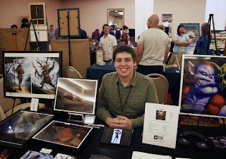
Me and my Showcase table (night 2: Return of Jafar) Photo courtesy Will Dudla
Today marks one week since Illuxcon 6 ended, and man this year was the best one yet! Hopefully at some point I'll get a chance to come up with a post that chronicles my con week but until then I just wanted to share the notes I took while at the con.

With so many great demos and lectures to attend and a lot of them overlapping, or with having to leave in the middle of one to have a portfolio review, there's always been this slight frustration that I'm missing out a little. I shared my notes from last year's IlluXcon and I got some good feedback so I thought I'd try it again this year in case anyone missed out on something they wanted to attend. I know my notes can never live up to actually going to the events themselves but hopefully some of you can get something out of what I wrote.

Below you'll find my notes which you can read right here on my blog, or if you prefer to have them on your computer you can click on the link below to access a Dropbox folder where you can download a .doc file containing my notes from Illuxcon 6 as well . Let me know if you're able to get anything out of it as well. Enjoy!

Illuxcon 6 notes (.doc file):

 
Mike Burns’s Illuxcon 6 Notes                             artburns.blogspot.com


How to Build a Portfolio: Jon Schindehette & Lauren Panepinto

A Portfolio is…
            - A collection of your best work
            - Targeted at a specific ‘market’ or ‘client’
            - Has a ‘purpose’

In order to create the most successful portfolio for yourself you have to answer the question “What do you want to do?”

Make sure to have leave behinds for your portfolio reviews. It gives the art director something to remember you by, and they can write notes about your work on the back.

Put your best work first.

An art director will decide yes or no based on your first image, the rest of your portfolio is just to show consistency in quality.

Order the work in your portfolio based on quality and flow rather than by grouping the horizontals and the verticals.

Don’t print your horizontal pieces on two separate pages and have to view the piece across a two-page spread. Keep one image on one page.

Don’t print horizontal images smaller so that the art director doesn’t have to turn the book, it’s more important to see the image large. It’s part of the art directors job to turn the book if necessary, it’s not as bad as it may seem.


Important points for doing work for Magic: the Gathering. Their art requires strong composition, strong outlines, and strong contrast. Magic cards must have a quick read. The art must be readable upside down, from across the game table.


Figure Drawing Demo: E.M. Gist

When drawing the waist, it’s better to build it up from 2 triangles rather than just two parallel lines.

Remember that everything under the skin connects and overlaps, and the skin lays over everything, revealing what’s underneath.

Mass = Effect of light on structure

Most important parts to a dynamic pose: Head, Ribcage, Hips

When drawing from life/reference, if a shadow/detail on the model would appear awkward in your drawing, don’t draw it exactly the way you see it, adjust what you see so it appears comfortably in your drawing.


Concept Art Vs. Illustration: Jon Schindehette & Robh Ruppel

Illustration = the end product is the final piece
Concept Art  = the process is the final piece

Concept art says, take an idea that’s /-------------------this general-------------------/
…and narrow it down to something /-this specific-/

In order to make it in the art world, you need to find the one thing that you want to do and be best person at it, Make people seek you out for that one thing, then start to build up your other skills / fields (for example get really good at environments so you can start getting work for that, then start building up your other skills

When you’re given an art test to do for a company, it isn’t just about skill, it’s also about how you think. If an AD gives you 3 items that take up to 72 hours of work to do in the span of 24 hours, they are trying to see how you’ll split up your time. Will you spend all of your time on just 1 item? Will you split up your time equally among all 3 items? Why? Make decisions based on making the highest impact.

If you have 10 things you need to do, but you only have time to do 3, how are you going to decide what you wind up doing. What gets done and what does not. You never have enough hours in the day to do everything, so you have to be good at making the decisions of how to approach what you have to do.

Jon stated that illustrations for him come in a 4-step process:
1. Thumbnail
2. Detailed Drawing
3. Color Studies
4. Final

Take some time to think about how to get the job done.

Figure out what process works for you. Everyone has his or her own workflow, there is no right way other than what’s right for you.

Concept artists are mainly broken up into 2 groups: Character people & Environment People

Character artists need to focus on: action shots, gesture, and expression

Environment artists need to show that they understand how the real world is put together (how does a bush fit into the ground), focus on the size of bricks, floor planks, etc. in relation to size of the character occupying the space.

Biggest environment no-no: Generic – think about how the buildings are held up, what are they made of, does it fit into the setting? Don’t just think “I want to make a cool looking castle” look at real castles and learn why they look the way they do, how they’re built, etc.

Carry a sketchbook to help you understand your world. A sketchbook shouldn’t just be considered a book full of pretty drawings, it’s not just to build up technical skill, it should be considered an examination tool.

When using reference from the real world in a fantasy setting, aim for making the viewer feel “this kind of reminds me of…”

Accurate details & Abstract shapes. You want to aim for believable scale and detail while also having interesting shapes.


Painting Between the Lines: Donato Giancola:

When tackling a book cover illustration, you don’t always have to pick a climactic moment. Take a non-important moment in the story, and try to capture the essence of a character.

Focus on in-between/mundane moments and elevate them.

Take on the biggest challenges in your work today, It will force you to learn and push yourself and your work forward.

Find ways to throw curveballs at your viewers.


Drawing and Inking Demo: Sean Murray:

Sketching is less about practicing technique and more about generating ideas.

Perspective is about thinking

Travel the world using Google Earth, walk through a new part of the world to help influence your work and make your own worlds more lush.

Niko-G Pen & Holder (Sean’s tools for inking)

Digital line work: Brush settings at less than 100% opacity and not 100% black, gives it more of a traditional inking feel.

Sean prefers to eliminate the white of a drawing instead of setting the drawing layer to a Multiply layer.


Magic: The Questioning: Winona Nelson, Anthony Palumbo, Jeff Menges, Karla Ortiz, Cynthia Sheppard, Dave Palumbo, Randy Gallegos, Steve Belledin, Donato (I think that’s everyone:

Maintain a professional relationship with all clients, they will help you down the road. Everyone talks to everyone in this industry so don’t burn your bridges.

Don’t let jobs push your portfolio in the wrong direction (something you don’t want to do) learn when it is wiser to say no, but keep in mind too many ‘no’s will make them think you don’t want to work with them.

Communicate, ask questions. An AD would rather answer an email than have to fix a problem that could’ve been prevented sooner.

6 week turn around (usually) 2-3 cards assigned per set of work, each set is commissioned in 2 waves.

Silhouette and shape are the most important things to focus on. Card must be readable from upside down and across the playing table.

Tuesday, September 10, 2013

Twas the Day Before IlluXcon

Twas the day before IlluXcon, 
when all through my mind,
I was so freaking excited, 
can't wait for good times.

Excuse that awful joke. It's the Eve of IlluXcon and I'm getting super excited! I've been waiting for this convention to come back around since the last one. While getting all of my stuff ready for the con, I realized I wanted to have a little more to have on display at my Showcase table so I spent the past couple weeks working up some original drawings for people to look through, which will also be available for purchase.

Below, you can see all of the drawings I did. If you'll be at IlluXcon this week and you like what you see, swing by my Showcase table and grab some for yourself!